Published 02/10/2012

It is said that humans were using maps before we even thought about writing stuff down1. They were highly useful tools, likely providing a range of different services, from plotting water holes and hunting grounds to spiritual areas to fighting arenas. Mapping is just as useful today, although technological advances and unparalleled access to data has changed the playing field somewhat. Nowadays, we use maps not just for finding our way around, but as a communications tool. We take a look at what this means for our fight against factory farming.
From place-naming to storytelling
Maps are no longer the sole domain of the direction seeker; we are developing increasingly creative ideas and sophisticated techniques to depict reality. Complex facts can be contextualised, trends can be visualised and we can tell powerful stories from around the world.
This means that cartography has become a powerful tool for campaigners. Amnesty International (20122), for example, created the "Eyes on Syria" map to highlight the enforced disappearances taking place in Syria. It links locational data with engaging content, putting human stories at the forefront of Amnesty’s communications and humanising the often abstract idea of human rights. A map by the Sylvia Earle Alliance (20123), "Hope Spots", draws the viewers’ attention to the beauty and vulnerability of marine areas around the world, illustrating the vast scale of the world’s oceans and their importance for our planet.
Perhaps most importantly, the power has shifted from map-maker to mainstream, allowing anyone to make their own maps and tell their own stories.
Mapping and factory farming
In the fight against factory farming, maps can be a useful weapon. Have you ever seen a factory farm? Likely not (or not knowingly), as the intensive-farming industry often goes to great lengths to hide its activities in an attempt to keep critics at bay. It's also likely that most of us don't have a sense of how prolific factory-farming activities are around the world.
Mapping factory-farming operations can therefore help raise awareness around their impacts and tell the stories of the people, places and animals that are affected by them. If we knew how close we lived to a factory farm and the negative impacts that the practice has around the world, we might think twice about buying that bargain beef or cut-price chicken.
We've taken a look at some of the organisations involved in factory-farm mapping and chosen our top three maps to share with you:
Food and Water Watch
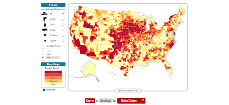
In this map, US campaign group Food and Water Watch presents farmed-animal density on a regional level, and uses an interactive format that allows the user to differentiate between species and filter the results by year. Check out the map.

UNFAO
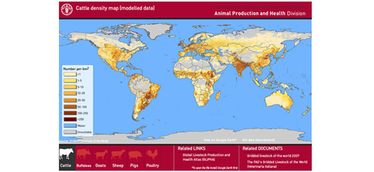
The UN Food and Agriculture Organisation has published a comparable map using 2005 data, but for the whole world (note the extreme poultry density in China). Check out the map.

Animal Visuals
Animal Visuals has produced a map highlighting the locations of farms that have had undercover investigations. A click on the location provides further information and footage. Check out the map.

Our thoughts
We like all three maps, although the first two could perhaps be refined by showing actual factory-farming data rather than general livestock data. The trick, of course, is identifying and accessing this data, which is all too often hidden away. We’ll continue to look at the use of maps in our work in months to come. Watch this space for more news.
Our sources
- University of Chicago Press (1987), The History of Cartography
- Amnesty International (2012), Eyes on Syria
- Sylvia Earle Alliance (2012), Hope Spots
Huge thanks to Stefan Kühn for the image (cc)
